Ensure you see your customers in three dimensions
A high quality Voice of the Customer program can be the tool that builds cross-functional bridges and allows your customers to take their rightful place at the heart of your business. But steering priorities with precision and confidence takes more than intent. This article discusses how to validate, supplement and present data sources and protect your customer's influence over company priorities.
SCIENCEMETHODOLOGYDATA
Kelvin Claridge
5/17/20244 min read
Customer-facing teams have long been tasked with being the eyes and ears of their company and championing customer perceptions and priorities. Over time, in-the-moment feedback and sporadic customer intelligence has matured into ongoing Voice of the Customer (VoC) programs.
Without a VoC program, an aspiration to be customer-centric cannot be lived and strategic priorities are missing their most important input and measure.
An effective VoC program should:
Use consistent, shared benchmarks, removing the need to explain/ re-explain potential impacts and debate priorities
Align to a framework that is understood company-wide, this provides context and accelerates the understanding of implications
Draw from multi-threaded sources, this fleshes out two-dimensional insights into a 3D understanding of your customer base, enabling you to build consensus around well-evidenced conclusions
It should be noted that a VoC program is best built as a proactive measure not in response to an outcome that needs to be explained. One-off or reactive customer intelligence metrics are frantically sourced rather than designed. Though it is perfectly possible to design pure-discovery initiatives that test ideas and theories, this can be fraught with difficulty because the method of collection is often work intensive and the ‘why’ is unclear to those collecting it.
Context is enormous
Customer intelligence can easily be confusing. A typical data set has masses of inconsistently populated, structured and unstructured data representing feedback from, and observations of, different segments and different times for different reasons.
The first two requirements for an effective VoC program (outlined above) are all about providing context to the signals available. Getting context right will bring cross-functional interests together, save time in explaining the facts of the research and enable you spend more time on interpretation and response.
Before you begin selecting and presenting metrics you need clarity on the program objectives and how this will be measured. Every business needs to identify a 'north star' metric that indicates a customer is on the path to wild success. This metric will be different for every business but it’s a good bet that the measure of that metric’s efficacy, is net revenue retention (NRR). With rare exception, NRR impact is the ultimate indicator of success for a scaling recurring revenue business.
Understanding the program’s objectives in detail will also guide your choice of framework. Think of the framework as the lens through which you understand (categorize intelligence about) your customer relationships. Some objectives will be best informed by using segment, market and/ or product, but most objectives (especially in recurring revenue models) will be best satisfied by using the customer journey as the basis for their VoC framework. Additional categories / lenses can be layered onto this.
Consistently presenting observations and feedback to the wider business within an agreed framework orients your audience (who won’t be so familiar with the data) and enhances understanding. Revisiting the same framework with the latest data also serves as an effective tool for measuring the businesses response to past VoC conclusions.
Multi-threaded sources
We have all seen scenarios where an established product roadmap or commercial principles are bypassed for one customer. And we're also familiar with the accompanying worry about the opportunity-cost to other customers and/ or the implications for ongoing expectation management. Proper source selection goes a long way to preventing knee-jerk reactions and along-side proper presentation, provides compelling evidence about where the biggest levers for revenue and reputation can be found.
To gain a well-rounded view of what your customers are really thinking and to draw confident conclusions, your findings should be supplemented/ corroborated by as many of the four data types as possible:


All metrics have a place and can be effective when used properly, many of the weakness outlined above can at least be partially mitigated with proper design or totally vindicated with cross-threading.
Presentation impacts interpretation
As we’ve seen, multi-threading metrics means your program is less susceptible to isolated weaknesses and can flesh out a more detailed, three-dimensional and real view of your customers… but how do you present all of this, by journey stage, by market, by product!
Many VoC programs have wonderfully-rich and rational findings, however there can be easily lost in their presentation. This can leave important conclusions obfuscated even for those familiar with data and or - more frustratingly - difficult to convince others of when you’ve done the hard work of identifying them.
The problem with presenting different dashboards and charts for each theme, market, segment, source etc, is that priorities can’t be compared; important considerations are skipped and audiences switch off. Even with clean data and decent integrations to modern CS and CRM platforms, strategic data visualizations that coherently represent several variables can be challenging.
Either though lack of investment, imperfect data or integrations, many customer-facing teams won’t have access to the intuitive tooling to help with complex visualizations.
Therein lies the challenge - how do you present such a breadth of data cohesively and clearly, so it is understood by all?
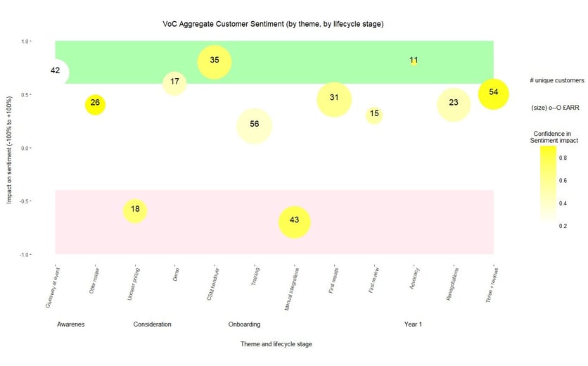
I have spent a lot of time working with different data tools to present tens of variables, exactly in line with the measures and frameworks agreed with the wider leadership team. While cluster charts are great for segmentation, a bubble diagram is superb for showing many variables in context of another - two axis layers, potential for two y axis measures, size, colour, text and potential for shape overlay makes for the easy comparison of a rich data set.
I built the above example (which includes aggregated sentiment by theme by stage, revenue and personal impact, market and product filters and an indication of confidence in the data based on the sources used) using an open source package in R which is a simple to map and populate using flat files dropped to an FTP location.
Drop me a line if you’d like help with you own VoC program!
References and further reading:
Chief customer officer 2.0, Jeanne Bliss – aligning leaders and customer experience
Back of the Napkin, Dan Roam – data visualisation
How to measure anything, Douglas Hubbard – calibrated estimates
Contact
hello@theartandthescience.com
© Kelvin Claridge 2025, original image (colourful ribbon) by kjpargeter on Freepik
Your email address will only ever be used to share the latest news and content from Art & Science Customer Success, we will never share it with third parties and you can unsubscribe any time.